Café Order App
UX CASE STUDY
Designed on Figma
Displayed with code
Design Process
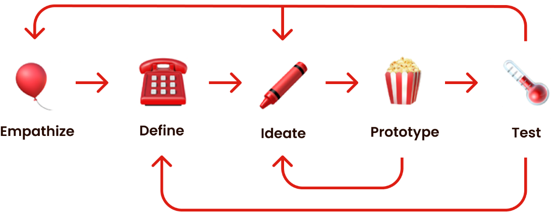
User Research
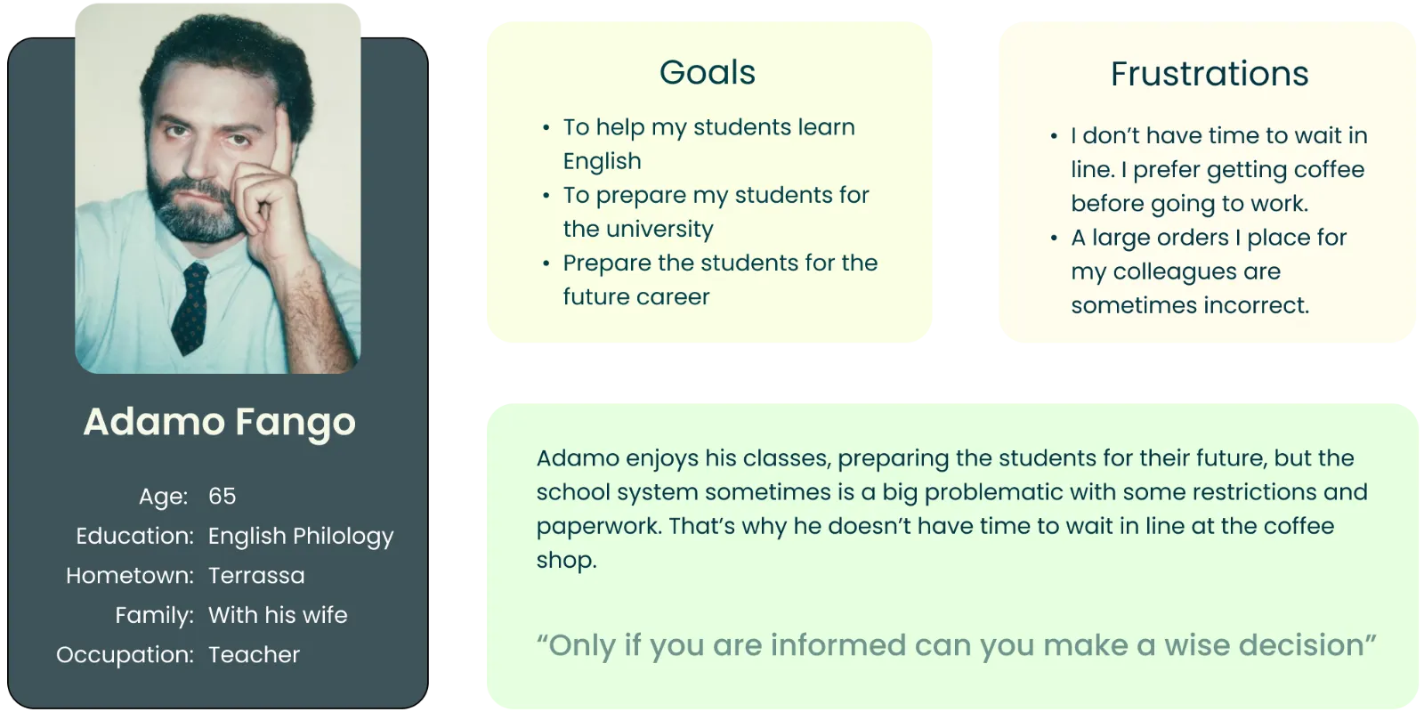
Persona
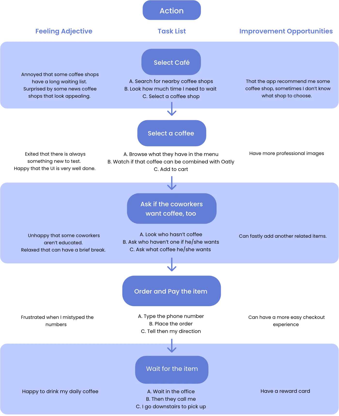
User Journey
Goal: An easy to use app for coffee lovers
Competitive Audit Report
Goal: Compare the user experience of each competitor's iPhone app
Competitors
Below I will represent every characteristic of a competitor
with a different “color”.
“Starbucks”
“Food Panda”
“Cama Café”
“Knock Knock”
“Dodo Café” (Our Company)
General information
Competitor type
Indirect
Indirect
Direct
Direct
App Store Link
Location
Worldwide
Taiwan
Taiwan
Taipei City
Taipei and Taichung
Business size
Big
Big
Medium
Small
Small
Target audience
Tourists
Millennials
Workers
Office Workers
Locals and Workers
Price
💸💸💸
💸💸
💸
💸💸
💸💸
Product offering
more than 20 types of coffee
All kind of foods and drinks
10+ types of coffee, hand selected coffee
Few variety of coffes
25 types of coffee
Unique value proposition
Some unique flavours of coffee and drinks
Wide variety to choose
Cheap and good coffee
Cheap and good coffee
Large variety of coffees from hundreds of local coffee shops
First Impressions
Desktop Website Experience
Outstanding
- Low resolution in the UI icons
+ Clear Branding
- Low resolution in the UI icons
+ Clear Branding
Outstanding
+ Fun and easy to use
+ Engaging animations
+ Have the same color scheme throughout the interface
+ Fun and easy to use
+ Engaging animations
+ Have the same color scheme throughout the interface
Good
+ Easy to navigate and find information
- Missing some functions
+ Easy to navigate and find information
- Missing some functions
Okay
- Missing some functions
- Missing some functions
Good
+ Visually appealing
- Feels dense and overwhelming in places
+ Visually appealing
- Feels dense and overwhelming in places
Mobile Website Experience
Outstanding
+ Fully responsive
+ intuitive layout
+ Menu is easy to read
+ Fully responsive
+ intuitive layout
+ Menu is easy to read
Outstanding
+ Fully responsive
+ Engaging animations (same as desktop)
+ App can be downloaded to collect points
+ Fully responsive
+ Engaging animations (same as desktop)
+ App can be downloaded to collect points
NOt good
+ Key information is present
- Not fully responsive
+ Key information is present
- Not fully responsive
Okay
- There are only ads in the home page
- Menu is hard to find
- There are only ads in the home page
- Menu is hard to find
Good
+ Fully responsive
- Interaction was not as smooth on mobile
+ Fully responsive
- Interaction was not as smooth on mobile
App Interaction
Features
Okay
+ "Create account" feature
- Users have to download PDF of menu to open it
+ "Create account" feature
- Users have to download PDF of menu to open it
Outstanding
+ "Create account" feature
+ "Trending" menu
+ Online ordering feature with pickup/delivery options
+ "Create account" feature
+ "Trending" menu
+ Online ordering feature with pickup/delivery options
Needs work
+ Store locator feature
- Checkout process requires user to input payment info twice
+ Store locator feature
- Checkout process requires user to input payment info twice
Okay
+ app features a discount
+ app features a discount
Good
+ Online ordering feature with pickup/delivery options
+ Users have to download PDF of menu to open it
+ "Create account" feature
+ Online ordering feature with pickup/delivery options
+ Users have to download PDF of menu to open it
+ "Create account" feature
Accessibility
Okay
= App only available in English and Chinese
- Menu is included as an image and is hard to read
= App only available in English and Chinese
- Menu is included as an image and is hard to read
Okay
= App only available in English and Chinese
+ Menu isn't included as an image and is easy to read
= App only available in English and Chinese
+ Menu isn't included as an image and is easy to read
Not Good
- Website available in Chinese
- Menu isn't compatible with screen reader technologies
- Website available in Chinese
- Menu isn't compatible with screen reader technologies
Not Good
- only Chinese
- Some images of menu items aren't clear and legible
- only Chinese
- Some images of menu items aren't clear and legible
Good
+ App available in four languages
+ Images of menu items are clear and legible
- Menu isn't compatible with screen reader technologies
+ App available in four languages
+ Images of menu items are clear and legible
- Menu isn't compatible with screen reader technologies
User Flow
Okay
+ Easy to find the menu
- Needed to search to find hours
- Home page is too busy
+ Easy to find the menu
- Needed to search to find hours
- Home page is too busy
Okay
+ Fun to use
- Difficult to find key info (menu, location, hours) due to animation load time
+ Fun to use
- Difficult to find key info (menu, location, hours) due to animation load time
Outstanding
+ Easy to find key info (menu, location, hours)
+ Info is kept up to date (e.g., holiday opening)
+ Easy to find key info (menu, location, hours)
+ Info is kept up to date (e.g., holiday opening)
Okay
+ Easy to navigate, four taps
- Difficult to find the complete menu
+ Easy to navigate, four taps
- Difficult to find the complete menu
Good
+ Easy to find key info (menu, location, hours)
- No clear hierarchy, difficult to scan quickly
+ Easy to find key info (menu, location, hours)
- No clear hierarchy, difficult to scan quickly
Navigation
Okay
+ easy to navigate
+ easy to navigate
Outstanding
+ Easy and fun way to navigate
+ Easy and fun way to navigate
Outstanding
+ Very easy to navigate
+ Familiar way to navigate (e.g., swipe)
+ Very easy to navigate
+ Familiar way to navigate (e.g., swipe)
Okay
- Somewhat difficult to navigate
- Some elements seem clickable but are not
- Somewhat difficult to navigate
- Some elements seem clickable but are not
Outstanding
+ Easy to navigate
+ Clear indication of clickable elements
+ Easy to navigate
+ Clear indication of clickable elements
App visual design
Brand identity
Outstanding
+ There is a brand identity at all
+ Clear color scheme and art direction
+ There is a brand identity at all
+ Clear color scheme and art direction
Outstanding
+ Strong brand identity, including colors, font, style, motion, imagery, and photography
+ Strong brand identity, including colors, font, style, motion, imagery, and photography
Okay
+ Clear color scheme and art direction
- Tabs font are photos instead of fonts
+ Clear color scheme and art direction
- Tabs font are photos instead of fonts
Good
+ Strong brand identity, including colors, font, style, motion, imagery, and photography
+ Strong brand identity, including colors, font, style, motion, imagery, and photography
Good
+ Clear color scheme, font, and art direction
- Inconsistent use of imagery and photography
+ Clear color scheme, font, and art direction
- Inconsistent use of imagery and photography
App Content
Tone
Friendly and indirect
Friendly and indirect
Friendly and direct
Serious and direct
Serious and direct
Friendly in some places
Friendly in some places
Descriptiveness
Outstanding
+ There is a brand identity at all
+ Clear color scheme and art direction
+ There is a brand identity at all
+ Clear color scheme and art direction
Good
+ Short and to the point
+ Easy to follow
+ Short and to the point
+ Easy to follow
Outstanding
+ Short and to the point
+ Short and to the point
Outstanding
+ Short
+ Short and to the point
+ Short
+ Short and to the point
Outstanding
+ All key info is present
+ All key info is present
Sketches
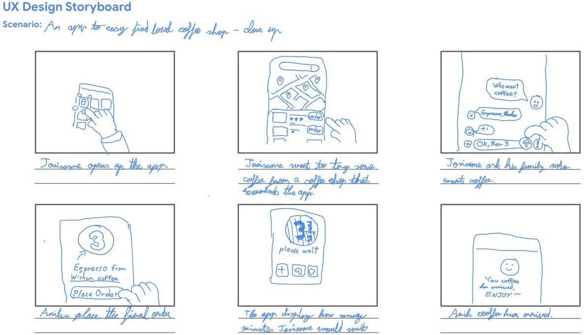
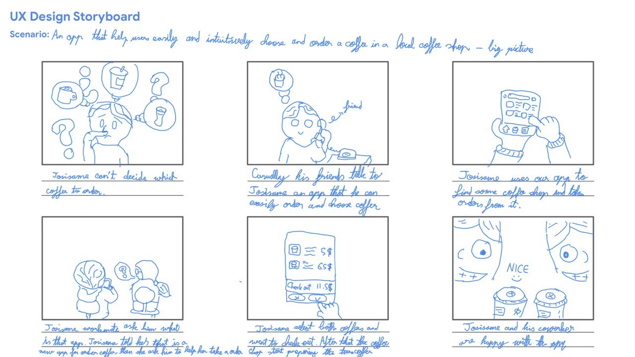
UX DESIGN STORY BOARDS
Big Picture
Close Up
